Interior design color combinations are the containers of people’s lives. The most important thing about interior design is that it is people-oriented, which requires designers to not only scientifically control the scale of people in indoor spaces, but also pay in-depth attention to the psychological level of people, achieving inter-person harmony and the harmony between people and space.
Based on the significance of interior design in guiding people’s emotions, this article analyzes the relationship between interior design color combinations and emotional space, explores the application strategies of colors in interior design, and discusses the insights and reflections gained from course assignments.
The Relationship Between Interior Design Color Combinations and Emotions
People are affected by the environment all the time. Interior design color combinations should not only consider the evaluation of color from an aesthetic point of view but also a social responsibility point of view, as color can transmit visual information and convey emotions at the same time, it is necessary to fully understand human psychology, and explore the infinite possibilities of the collision between color itself and human emotions.
Emotional space is a complex structure, which is the result of the joint action of elements such as sight, hearing, smell, touch, taste, light, and human body space. Among them, color, as a visual element, is one of the first components that people can feel when entering an indoor space, and it is also one of the most direct factors that promote human physiological activation or induce emotional reactions.
Interior design color combinations and emotions interact with each other. Color has the effects of encouraging, stimulating, infecting, responding to emergencies, and healing emotions, and people’s needs for various emotions also guide the composition of colors in interior design.
Emotional Associations of Combined Colors
There are many studies on the impact of monochrome on emotions, but there is a lack of research on the effects of interior design color combinations on people’s emotions. Based on life experience and case analysis, belowing lists the emotional associations and functional effects of some combined colors.
-
Blue + Yellow
For introverts who are socially phobic and not good at communication, blue relieves fear, and yellow gives them confidence and inspiration, actively promoting them to express themselves.
-
Orange + Gold + Violet
For patients with anorexia, use highly saturated colors such as orange and gold in the early stage of treatment to reduce their lack of confidence and induce appetite; after the symptoms improve, light yellow and violet can be used to keep the patient’s condition stable and balanced.
-
Blue + Green + Gray
They are used in meditation spaces or tea drinking spaces to obtain quiet and stable associations. Even if the space itself is small, these cold colors give people a backward visual effect, with a transparent and expanded psychological effect.
Application Strategies of Interior Design Color Combinations
(I) Color matching methods to create positive emotional spaces
The color matching of interior design should follow the law of change and unity. Colorless spaces should also seek subtle changes in unity to create a pure and peaceful or warm and comfortable feeling; adding a touch of monochrome based on colorlessness will give the interior a clear emotional orientation.
Using contrasting colors can make the entire space full of vitality and charm, but the two colors should not be too balanced, otherwise, it will not highlight the key points and cannot form the beauty and emotional guidance function.
(II) Matching color and other visual elements
Emotional space is not static. When a single-color visual element is transformed into a composite visual element, the role of emotional space changes accordingly. For example, a moderate amount of red can create a confident emotional space, while appropriately reducing the proportion of red, adding dots, and matching with white will release a happy mood. Visual elements also include shape, material, lighting, etc.
Only when color is fully combined with these visual elements can the entire interior space achieve the best visual perception. This requires designers to grasp the tone of the indoor environment before choosing colors, comprehensively consider the materials and shapes of visual objects such as walls, floors, ceilings, furniture, and ornaments, and which color will be combined to amplify the shining points, and at the same time consider whether the light environment used can set a golden edge for the shining points so that the color can have the maximum effect.
(III) Matching color under different user groups
People-oriented should choose colors according to factors such as the user’s gender and age. Different personality traits correspond to different emotional space elements, that is, the indoor space we design for different groups of people should be targeted so that this part of the population has emotional resonance or positive emotional effects for this specific space.
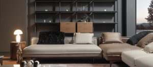
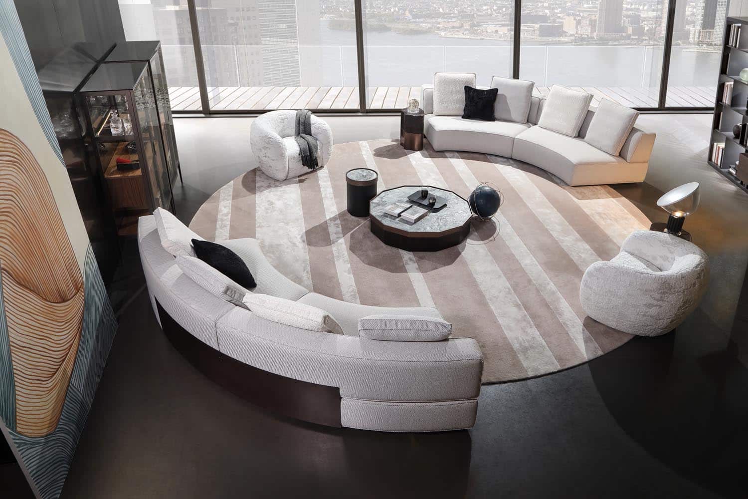
Cool colors such as blue, black, and gray are widely used in men’s indoor spaces, which are in line with men’s pursuit of mature and stable emotions. In men’s business spaces, large areas of gray are dignified and elegant, and paired with white or black, the entire space is high-end and refreshing, and the mood at work can be kept stable.
Women’s bright and lively emotions tend to be in indoor spaces with beige and light yellow as the main colors. Light colors brighten the space, and warm colors give the vision a sense of advancement, “compress” the space, and have a sense of security; since pink can bring women more happiness and happiness than red, it is also an excellent choice to embellish pink in light colors; retro light luxury style contrasting color indoor spaces are more suitable for elegant working women, and attractive environmental colors can make women full of confidence and improve creativity.
Conclusion
Overall, the color of a room has a complex effect on the perception of its users, and the way the façade is perceived can be very different depending on the color. Lamaisonaire offers various strategies for interior design color combinations, which are insightful and practical, addressing various aspects such as color matching tips, integration with other visual elements, and consideration for different user groups.